During the last eight decades, America has undergone a transformation like much of the world: From war and peace to technology and industry, the country has endured and progressed.
One way to measure a nation’s growth is through the wealth of its citizens. We looked at the rise and fall of earnings over the past 85 years, zeroing in on average personal income by state and region, to produce a short history of America’s wages.
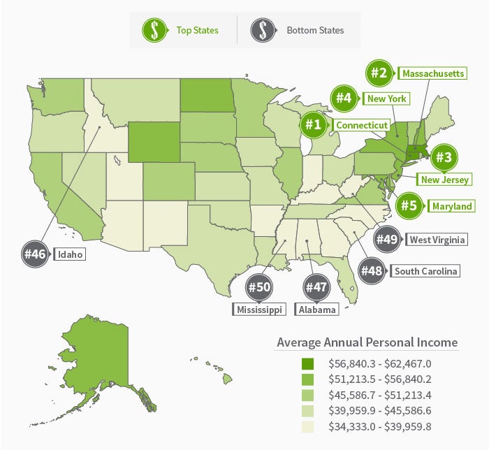
85 Years of Income
The rise and fall of America’s average income seems to correlate with periods of economic stability and disaster. Between 1929 and 1933, income falls sharply in every state. This corresponds with the Great Depression, which began in Aug. 1929 and ended in March 1933. Income then increased for the most part for the next 80 years, decreasing during the recessions defined by the National Bureau of Economic Research – in 1938, 1945, 1949, 1953, and in 2007 during the Great Recession caused by the subprime mortgage crisis.
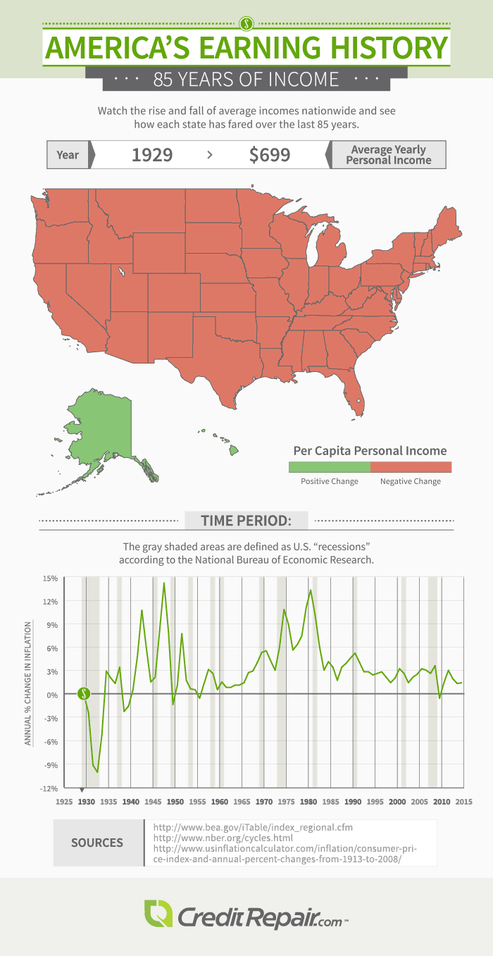
30 Years of Income
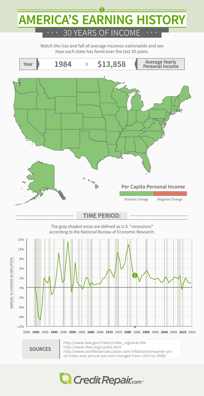
30 Years of Spending
The average yearly personal income increased from $13,858 in 1984 to $44,765 in 2013, which means Americans are now making more money than ever before. But, surprisingly, they are also spending less of their paychecks.
From 1984 to 1987, Americans actually spent more than they made; expenditures peaked in 1985, when the average American spent 114 percent of their income. However, over the next two decades, this figure dropped significantly. By 2013, Americans only spent 71 percent of their income.
Americans spend money on three top categories: entertainment, food, and housing. However, the percentage of income spent on each of these also dropped over time. Entertainment spending steadily declined from 8 percent in 1984 to 6 percent in 2013; food spending fell sharply, from 17 percent to 9 percent; and housing declined from 34 percent to 24 percent.
Average Personal Income in 2014
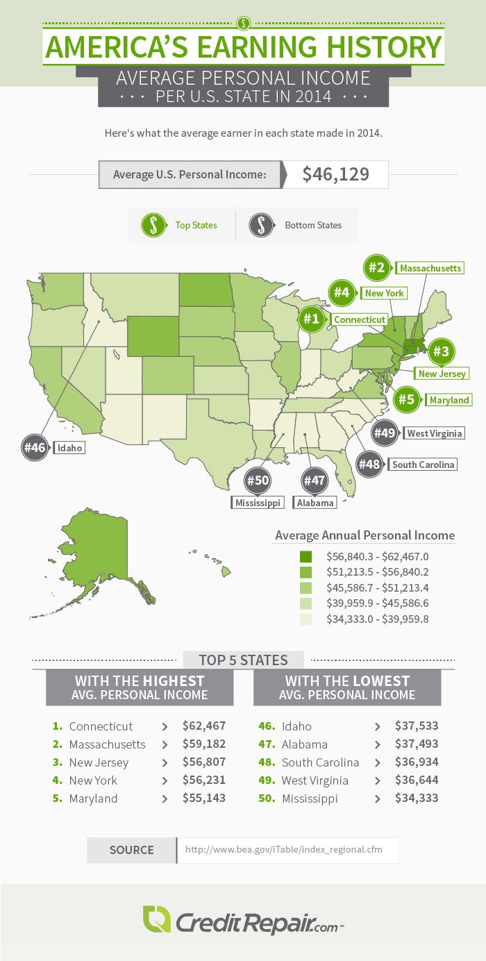
The average resident of Connecticut, the state with the highest income, earned $62,467 in 2014 – $16,338 more than the average American. However, in Mississippi, the average earner made $34,333, which is $11,796 less than average. The average personal income difference between people living in Connecticut and Mississippi is an astonishing $28,134.
The top-earning states, aside from their shared Mideast region, also have minimum wage laws in common, which may potentially account for some of the gap in income: Every state in the top five has a higher minimum wage than the federal standard. The five least-earning states either have no state minimum wage laws at all or have laws set at the federal minimum.
Additionally, poverty levels in the top five states all fall under the national poverty rate of 15.4 percent; poverty levels in the bottom five states are all above the national rate, with last-place Mississippi at a staggering 22.7 percent.
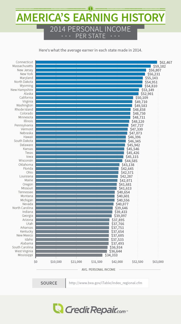
Personal Income per State
Disparity by Decade
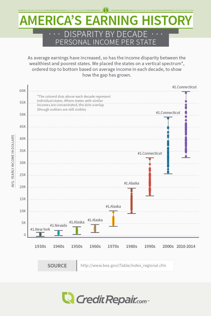
Over the past 85 years, income disparity has increased across the board. New York, Nevada, Alaska, and Connecticut each held the title of richest state at one point – Alaska for four decades, Connecticut for three. But according to this distribution of average earnings, Mississippi has been the poorest state in America for more than eight decades.
Why is Mississippi consistently falling behind the rest of the country? Aside from its high poverty rate, Mississippi – as well as most of the Southeast – has very low economic mobility, meaning that someone born in poverty will likely remain in poverty. Connecticut, as well as other well-off states, has higher mobility and lower poverty, which could be a contributing factor to its steep average income.
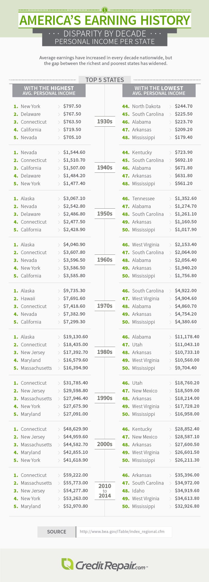
Disparity by Decade
Regional Earnings
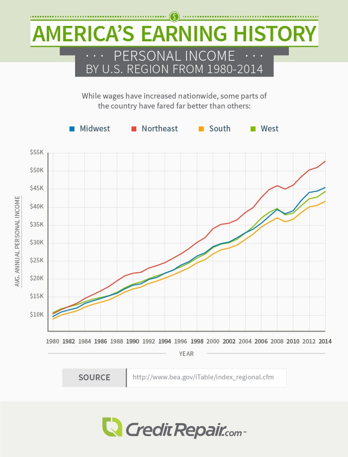
Although wages have increased nationwide over the last 85 years, some regions have prospered far more than others. In the first five decades, the divide between different parts of the country was not so apparent: While the average personal incomes of the Mideast and Far West stayed above the national average, the gap between the North and South wasn’t as large as it is now.
In 1930, the average Mideastern resident made $890, while the average Southeastern resident made $310. However, by 2014, the Mideast is raking in $54,062, while the Southeast trails behind at $40,843.
As overall earnings have increased – save for a drop across the board between 2008 and 2009, during the Great Recession – the chasm between the Mideast and Far West and the Southern regions has widened considerably. The Mideast is by far outpacing the rest of the nation in its sharp rise in wages.
Conclusion
Over the past 85 years, the average American’s earnings have soared – along with inflation, income disparity, and economic inequality. While Americans are now spending less of their sizable paychecks, some earners, depending on which state they live in, have larger paychecks to allocate. Some Mideastern states are far ahead of the curve, while other Southern states – Mississippi especially – have fallen far behind.
Methodology
For 85 and 30 Years of Income: We collected the data from the Bureau of Economic Analysis’s regional data and calculated the percent change in personal income for each period. If the change was positive, we colored the state green; if the change was negative, we colored the state red. We noted the recessions in gray on the inflation map timeline based on the National Bureau of Economic Research’s business cycle expansions and contractions.
For 30 Years of Spending: The average personal incomes were based on the data above. We determined average expenses with the Bureau of Labor Statistics’ databases and their average price tool, which gave us the U.S. city average cost of various items. However, this number was per household, so we divided the cost for each year by the number of earners per household based on the BLS’s definition.
For Income Map 2014 and Disparity by Decade: We determined the average personal income for each state based on the BEA’s data.
For Regional Earnings: Again, we used the BEA’s data to find the average personal income for each state and then combined the states by region and averaged their personal incomes for the year.
Fair Use Statement
Feel free to share the images found on this page freely. While doing so, we ask that you please attribute the authors of this project by providing your readers with a link back to this page. Doing so will allow readers to learn more about the research and methodology behind the project.
Sources
- https://www.bea.gov/iTable/index_regional.cfm
- https://nber.org/cycles.html
- https://www.federalreservehistory.org/essays/great-recession-of-200709
- https://www.bls.gov/data/
- https://www.bls.gov/cex/csxstnd.htm
- https://www.ncsl.org/research/labor-and-employment/state-minimum-wage-chart.aspx
- https://www.dol.gov/whd/minwage/america.htm
- https://quickfacts.census.gov/qfd/states/
- https://www.nytimes.com/2013/07/22/business/in-climbing-income-ladder-location-matters.html?pagewanted=all&_r=3&#map-search